I entered a design competition to design an electronic medical card for Globosphere Russia in 2020.
The Problem
The current outpatient card is not visually appealing, and looks more like a store receipt. Furthermore, the layout is incomprehensible and difficult to follow, especially for patients with long history of treatments with different doctors.
The Task
Design a modern electronic medical card interface that is clear to understand and easy to use, both for patients and doctors.
Demographic
I was asked to pick a particular demographic group to focus on, so I chose young adults as the target user.
What I Did
- Persona creation
- Card sorting workshop
- Wireframes
- UI & High Fidelity Design
- User testing
Persona

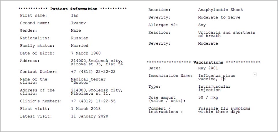
Ivan Ivanov, 24 years old male.
Ivan was diagnosed with asthma when he was 4 years old. He regularly visits his doctor for checkups. Other than that, he is healthy and regularly exercises, and is conscious about his diet.
Sketches
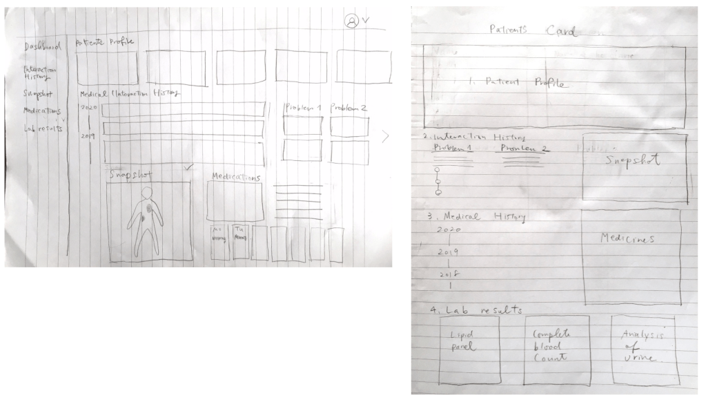
I usually start the design process by sketching out ideas. This is the way I iterate through many design options quickly.
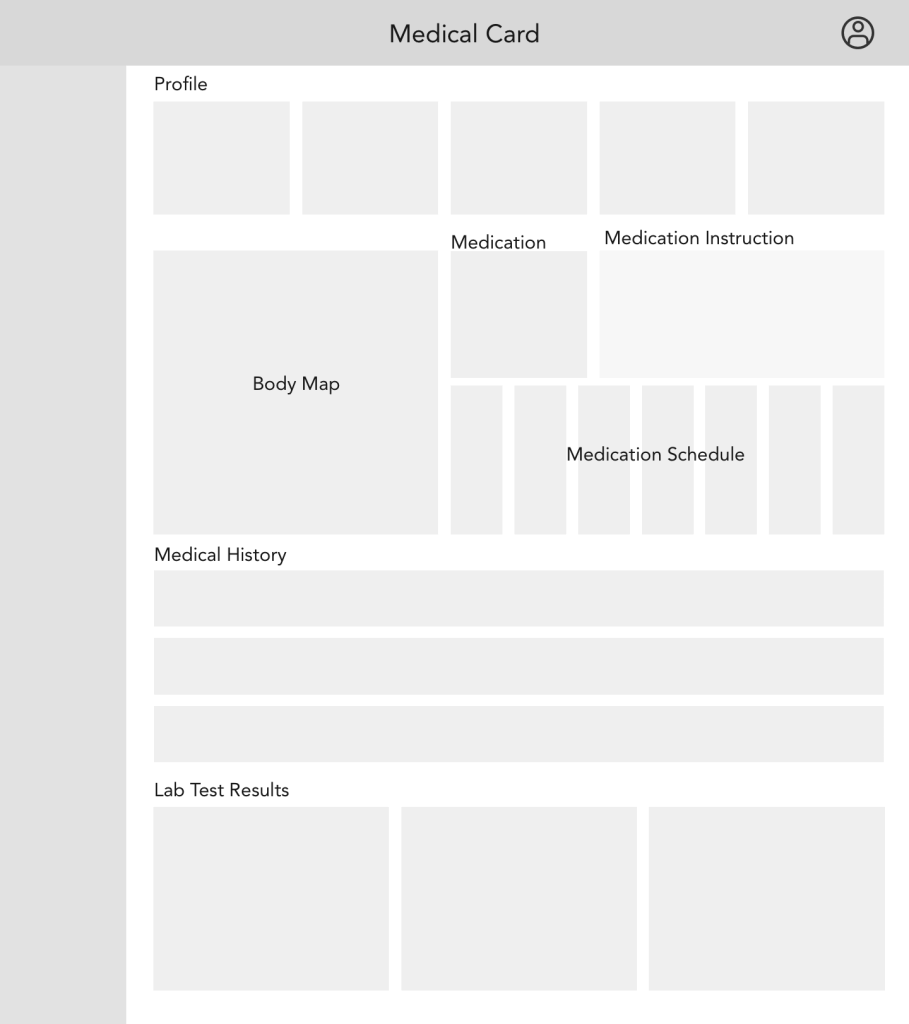
Low Fidelity Wireframes
Then I created lo-fi wireframes in Sketch to further refine the layout options.
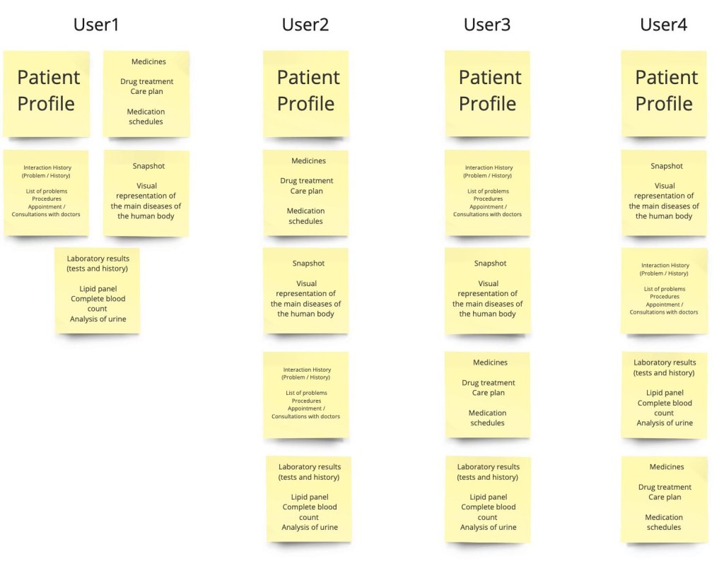
Card Sorting
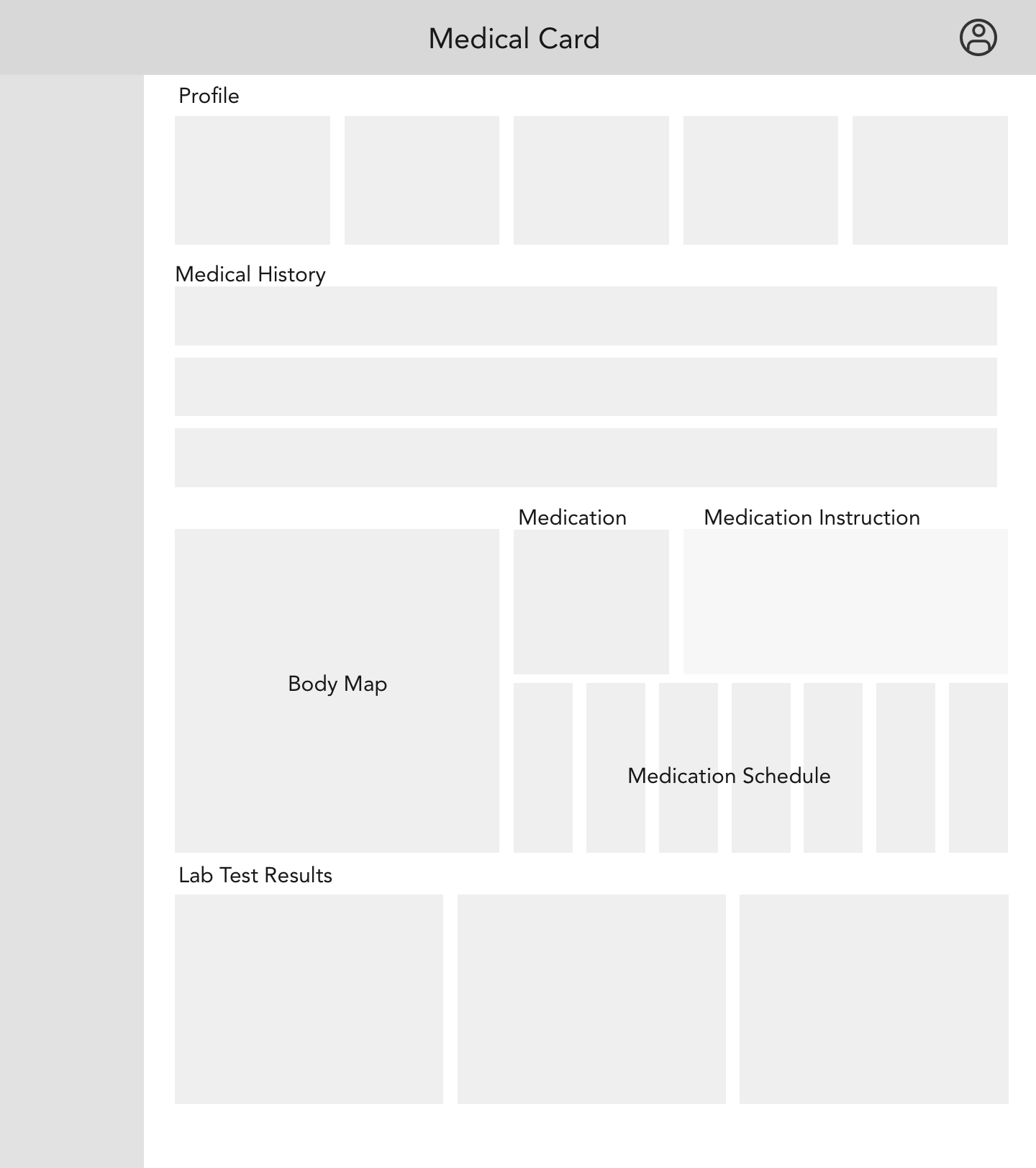
I also conducted a card sorting workshop with users. I asked them to sort the required elements (patients profile, medication schedule, body map, medical history, lab test results) in the order of importance. Specifically, I asked them what they would like to see at the top page, and which elements could be placed lower on the page. These suggestions influenced my thinking about the layout of the interface.
Iteration
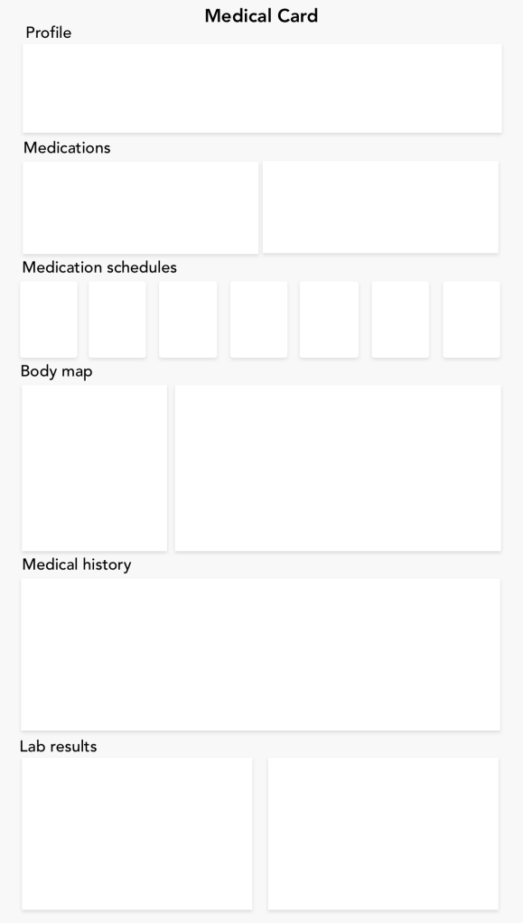
In the next step, I reworked on the lo-fi wireframe and revised the layout. I also removed menu panel on the left, for a cleaner composition.
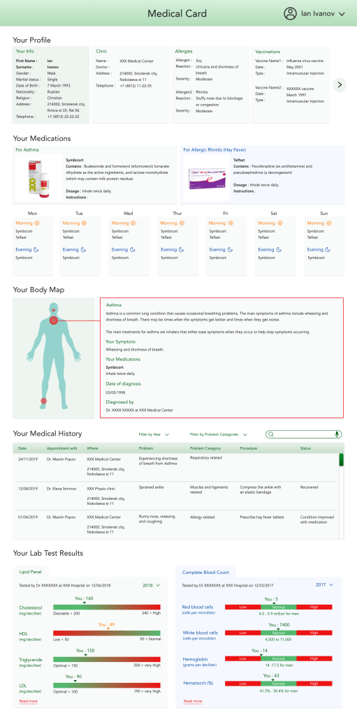
High Fidelity Wireframe
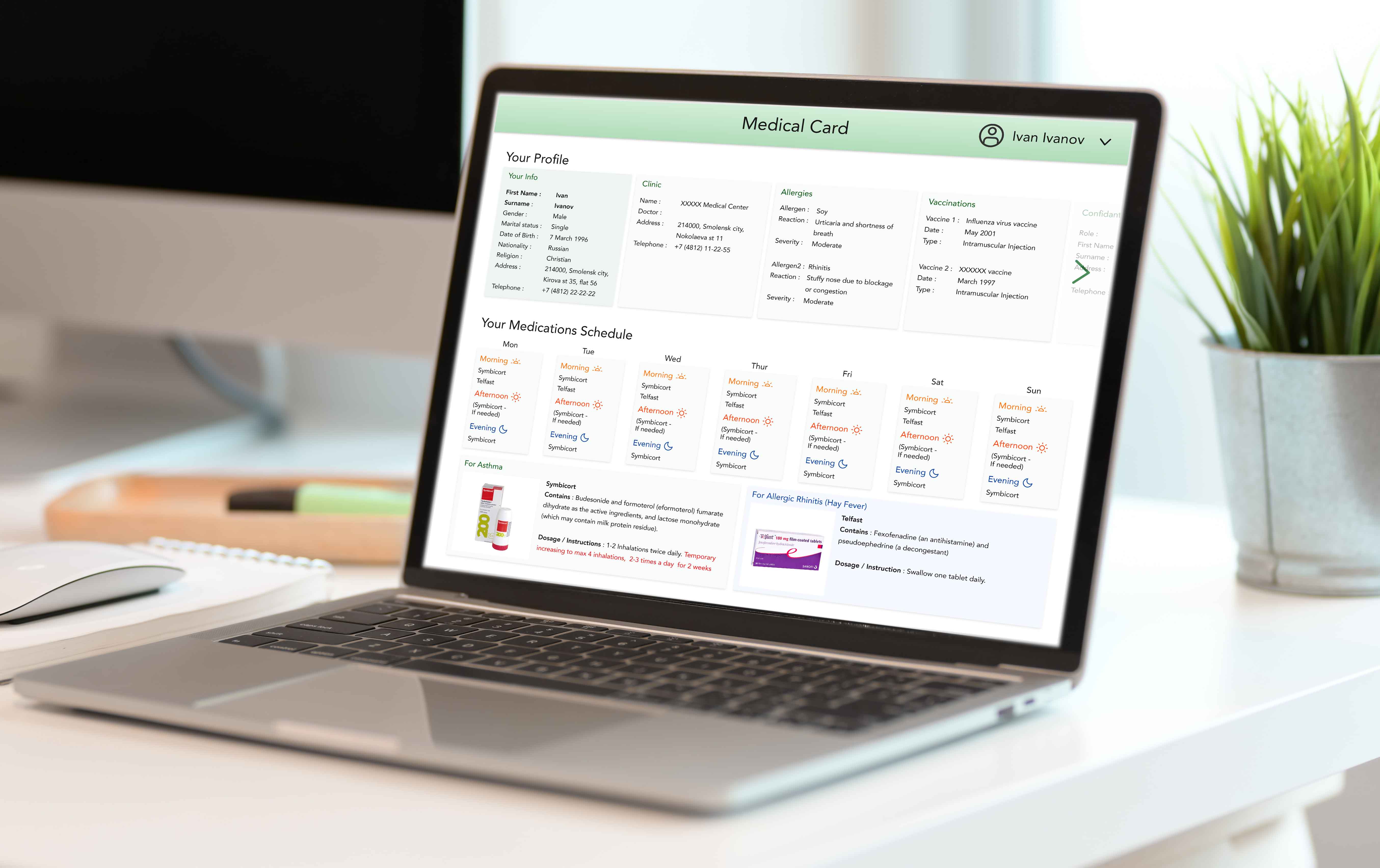
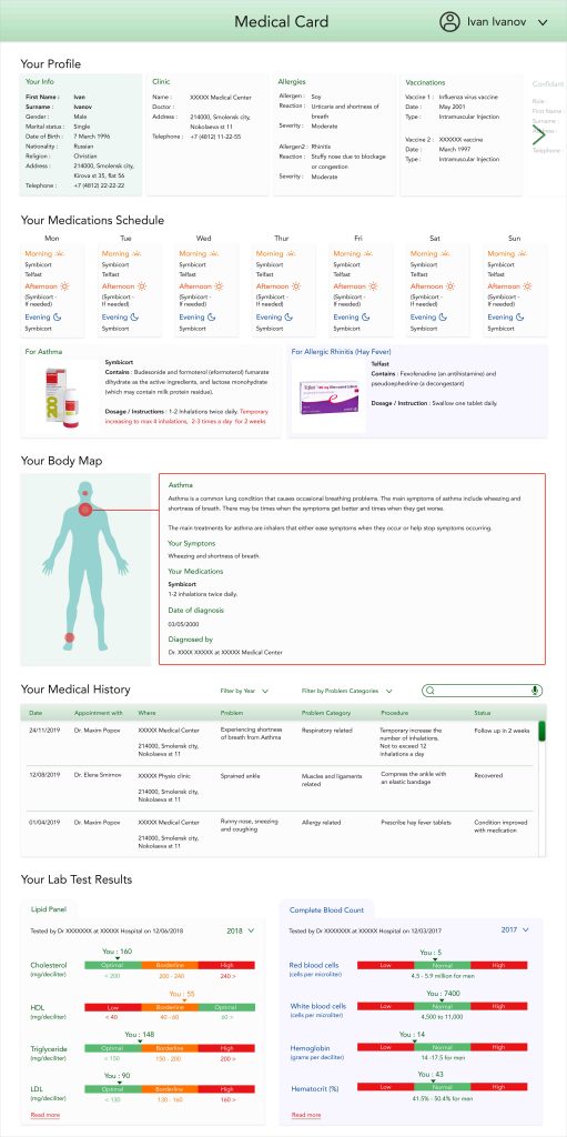
I then moved on to creating a hi-fi wireframe. I chose a green colour scheme, as green is said to be the comforting color that can diffuse anxiety and help people stay calm and refreshed. My aim was to make the interface look simple, modern and easy to understand for youth and wider audience.
User Feedback
I then collected initial feedback from a few users.
Findings:
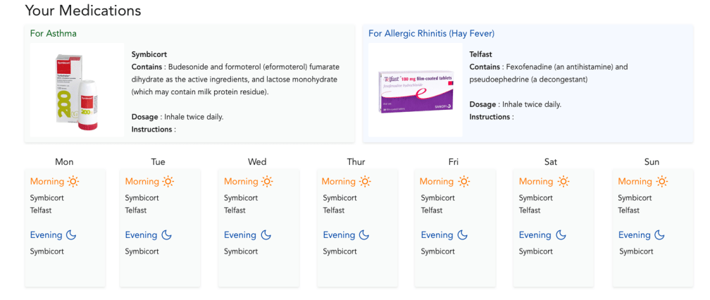
- Some user thought the medication schedule was very important, yet difficult to spot on the page.
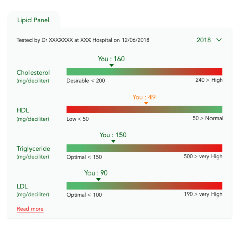
- Complete Blood Count charts were received positively, but some users did not like the Lipid Panel charts as much, because the gradation bars made it harder to see whether the readings were in the desired range.
My solutions:
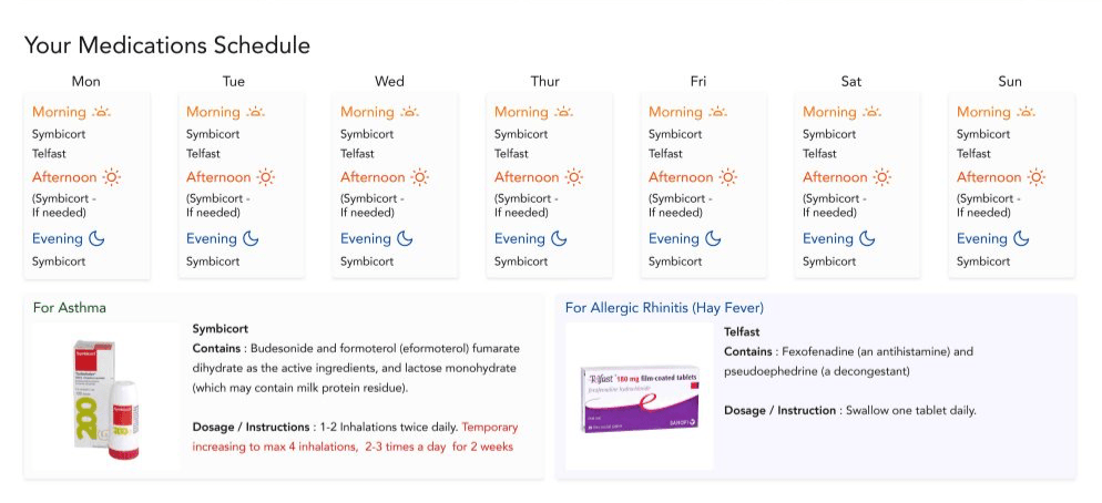
- Swapped the order of the medication schedule and the medication info, and changed the title to ‘Your medication schedule’.
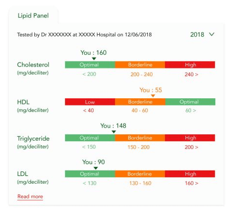
- Re-designed the Lipid Panel charts to make a clear disctinction between the desirable and undesirable ranges.
Final Design
Result
Although I did not win this competition, this project taught me how to create an interface with complex data visually interesting and useful to users.
