I improved the robo-adviser tool on the leading British bank’s investment platform as a lead designer.
Timeline: The project started at the end of 2023 and went live in the autumn of 2024
Project overview
Our product delivery team was asked to reimagine the existing robo-advice journey on the bank’s platforms for customers because:
- The existing journey had a very low conversion rate
- It was first built 6 years ago, so some areas of the journey needed to be updated and improved
The goal of the project was to improve the journey and increase the conversion rate
Research
To understand the problem, I conducted a series of research:
- Adobe Analytics to find out where customers drop off
- Observed the guided advice service (a service in which a customer uses the same tool being guided by a Wealth Manager on a video call)
- Interviewed 8 Wealth Managers to find out what they know about the customers’ pain points
- Conducted competitive analysis to learn from other robo-adviser journeys

Findings from the research
From the data, I found that many customers drop off at the early stage of the journey when they have to read through the wall of text about the investment risk.
I also discovered several pain points through interviews. For example, once the Investment report is generated, customers cannot change any details such as the investment amounts. This could be an issue, as many customers want to think over for a few days before committing to invest, and when they come back, they sometimes want to reduce the investment amount. In this case, they had to restart the journey from the beginning.
Other pain points include: the journey is overwhelming as it asks many questions, and some questions are difficult to understand.
Design Process
Ideation
Based on the pain points I discovered during the research, I created User Need Statements and How Might We statements and ran an ideation workshop with the product delivery team and stakeholders.
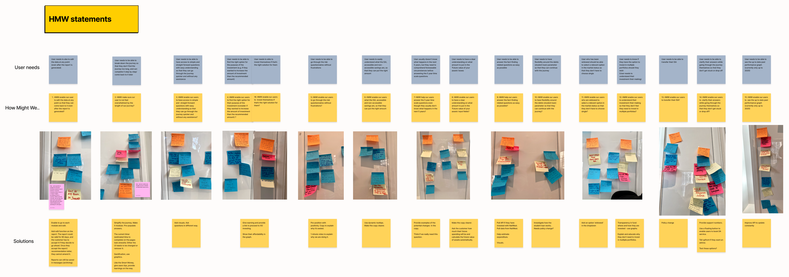
Some of the solutions we came up with are:
- Modularise the journey so that it doesn’t overwhelm the customers. Make it easy to update.
- Cut down the information around investment risk, make it minimal, and spread it out throughout the journey so that the customer won’t be discouraged by reading the wall of text in the beginning.
- Warn the customer that once the suitability report is generated, they won’t be able to amend the investment amount or the risk level. Enabling to edit them would be implemented as a later enhancement (as it will involve the policy change).
- Keep the wording and questions simple and easy to understand, use plain English.
Improving user flow
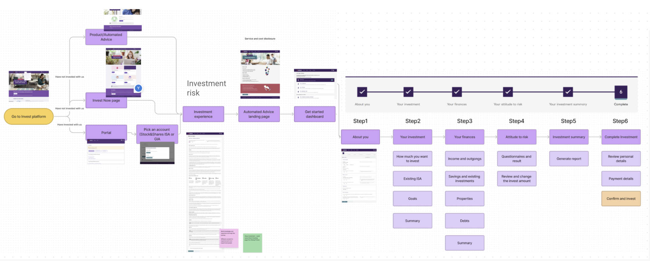
Next, I had a look at the previous userflow. Areas of improvement that I suggested were:
- Make the service information page (landing page) more informative, clearly state the benefit of the service and bring this page up, right after the entry point, so that the customers understand how this service could help them before starting the journey
- Break down the financial assessment steps into smaller modules and enable customers to complete them in any order anytime, rather than linear steps
- Check customer’s eligibility earlier in the journey so that we won’t waste their time if they are ineligible
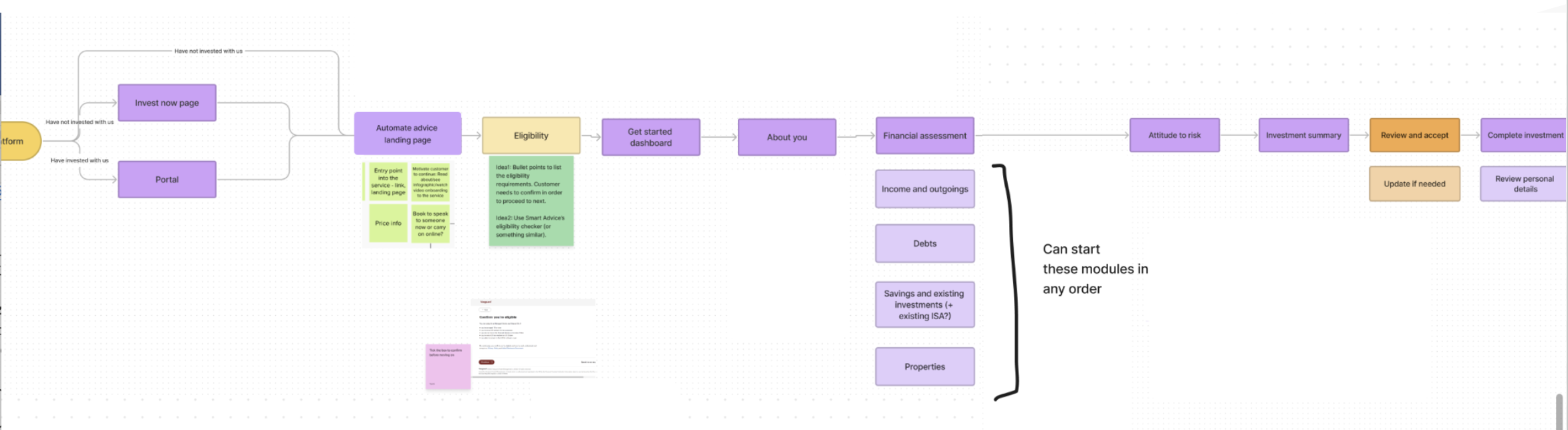
Roadmapping
After agreeing on the userflow with the team, we discussed the timeframe and created a roadmap together (Roadmapping led by our Product Manager).
Working on Stories and design
Based on the Roadmap, we created User Stories and I worked on the design for each feature and module
A few examples of the design improvements I made:
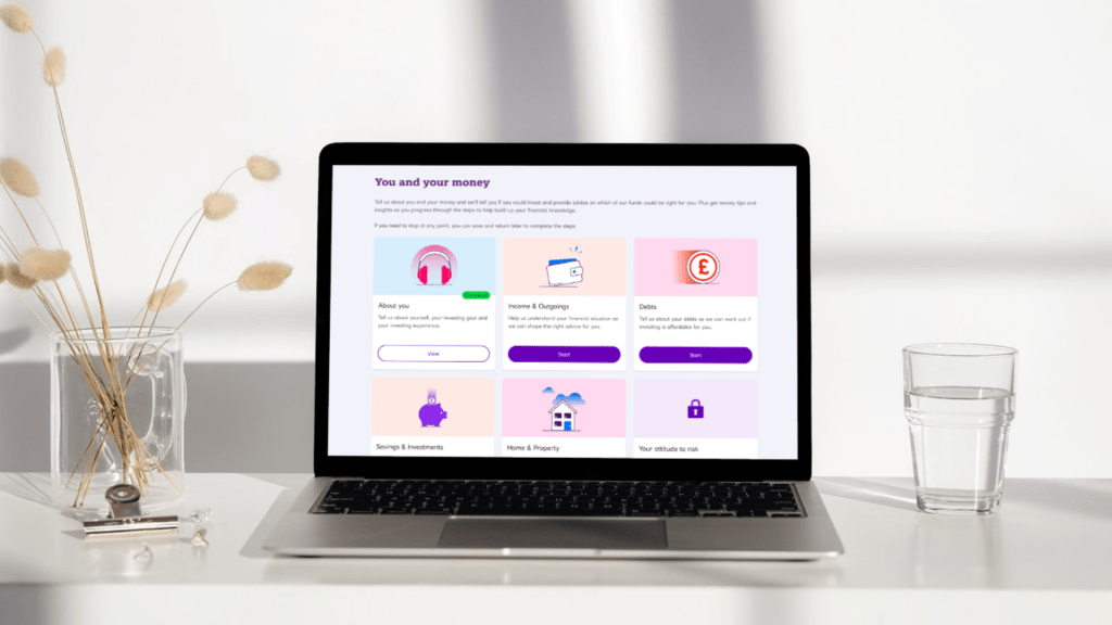
1. Dashboard
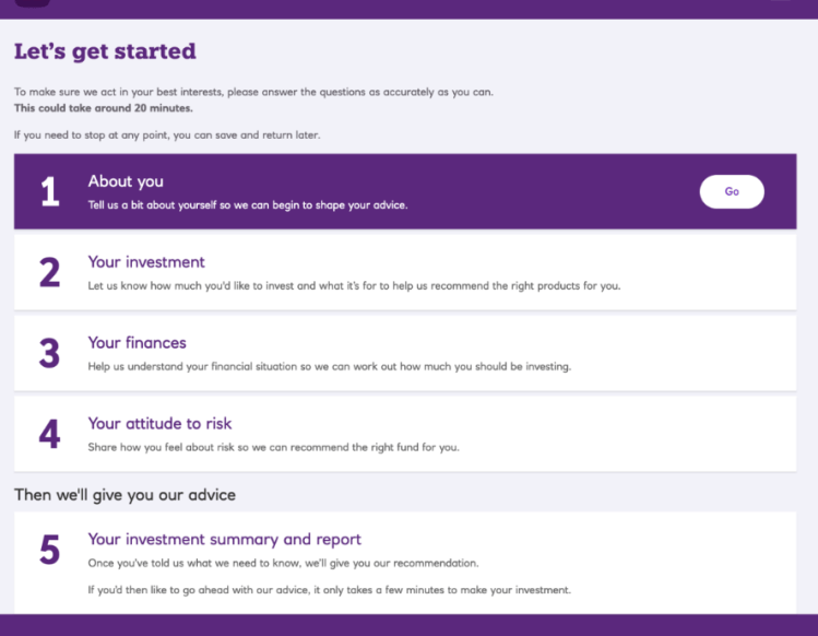
Previously it was a linear journey and the customers had to follow each step in order.
In the new journey, I modularised the journey so that the customers could answer their finance-related questions in any order. This helped customers not to feel overwhelmed by the number of questions and made it easier for them to fill in what they could and resume later if needed.
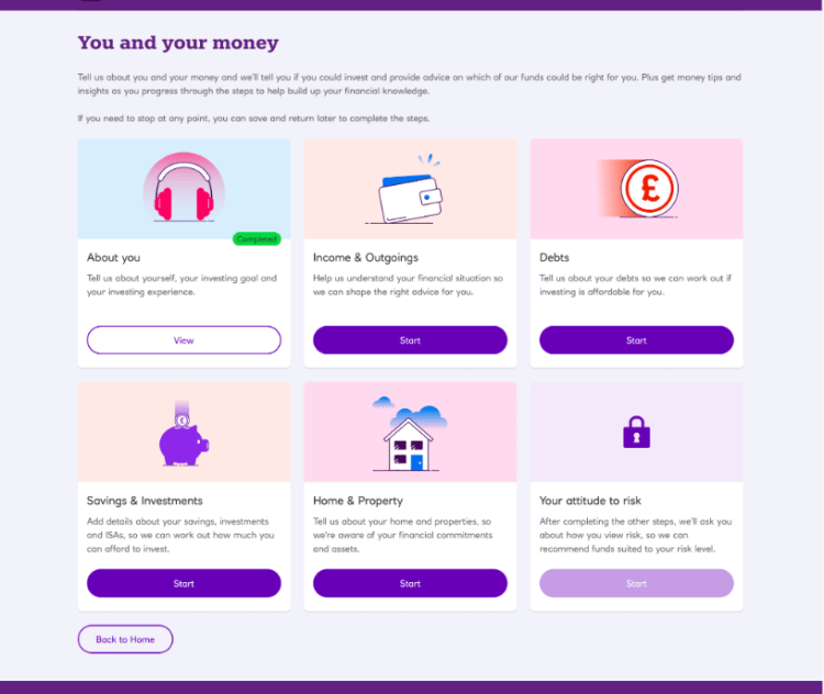
The customer’s quote during the user testing: “Fill out what I can, and come back to it later on the part I haven’t finished is useful”
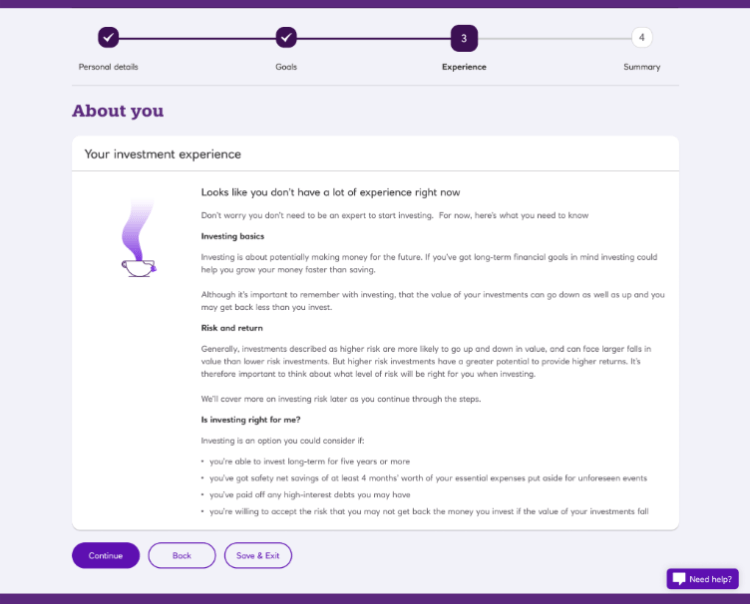
2. Investment Risk Informtion
Previously this was a wall of text relating to the investment risk that appeared at the beginning of the journey. The drop-off rate on this page was high.
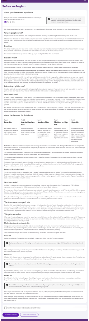
In the new journey, I cut down the unnecessary information, and spread the content across the journey so that the customer doesn’t have to read it in one go. I also decided to show this information only after they’ve read the benefits of our service and gone through the eligibility check.
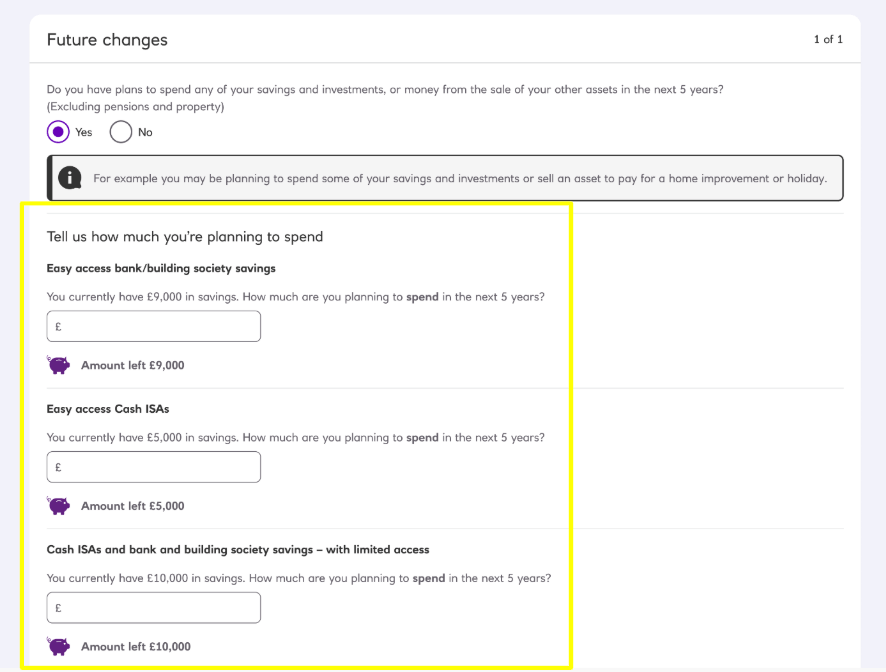
3. Savings and Investments
In the previous journey, we identified the pain points around entering the future value of assets.
- Customers don’t know if their value of assets will decrease in the next 10 years, and if so how much – “10 years is too long to predict, anything can happen”
- Many customers put the current value of assets in the section ‘What will they change to?’ instead of the future value
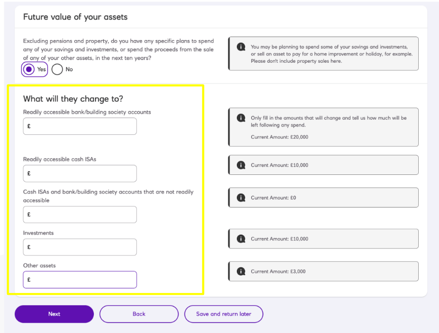
In the new journey, we decided to ask if the customers have a plan to spend any of their savings and investments in the next 5 years (minimum investment period) instead of 10 years, and how much they are planning to spend instead of how much their future assets would be so that we can automatically calculate it for them. This proved in the user testing that the customers had no issues filling in the form with the new design and found this automatic calculation useful.
User testing
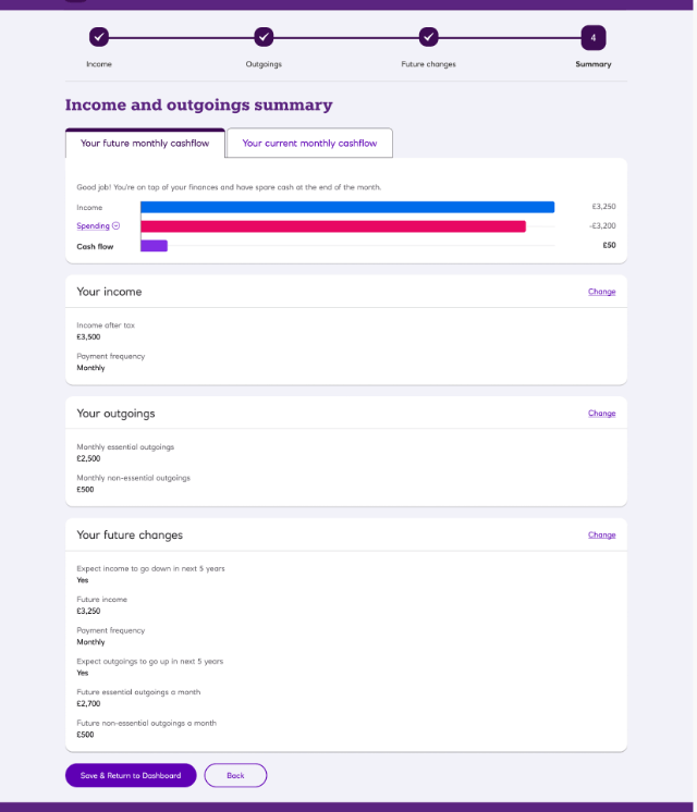
For user testing, we recruited 6 participants to test and validate the design. All the participants were able to complete the journey successfully, but there were a few areas that needed some iteration. For example a cashflow graph on the Saving and Investments module.
Half the participants thought the graph was confusing because the income and spending bars faced different directions. They also did not realise that the graph showed future cash flow rather than present cash flow.
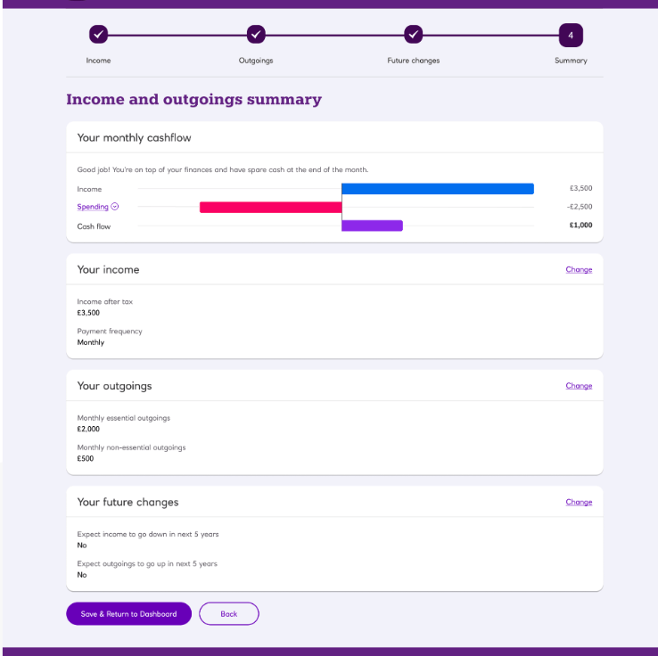
Therefore I iterated on the design to have all the bars (income/spending/cashflow) face the same direction. I also introduced the tabs so that the users can switch between the future cash flow and the current cash flow graph.
Result
The improved platform was well received by the customers and the Wealth Managers.
“Being able to do financial modules in any order is useful” – customer
“New journey is a lot slicker, including lots of new features that will make speaking with clients and overall client experience much better” – Wealth Manager
